
Creating Effective Brand Guidelines
Brand guidelines don’t have to be complicated. Learn what to include, how detailed to get, and how to create documentation that your whole team actually uses.
Read MoreWhere your logo goes matters more than you’d think. We’ll walk you through header placement, footer positioning, and how to keep your brand visible without overwhelming the design.

Your logo isn’t just a graphic—it’s the visual anchor that tells visitors who you are. Get the placement wrong and you’ve wasted a perfect design opportunity. You’ll confuse users, dilute your brand presence, and make navigation harder than it needs to be.
The best logo placements aren’t about making your logo as big as possible. They’re about strategic visibility. Your logo needs to be there when someone first lands on your site, easy to find when they’re navigating, and consistent throughout the entire experience. That consistency is what builds recognition.
The header is your prime real estate. This is where most visitors expect to find your logo, and they’re right—it’s the most important location on the page. We’ve seen thousands of websites, and the ones that work best follow a simple pattern.
Top left positioning is the standard for a reason. It’s where eyes naturally move first in Western reading patterns. Users are trained to look there for navigation and branding. If you put your logo in the top left, you’re working with human behavior, not against it.
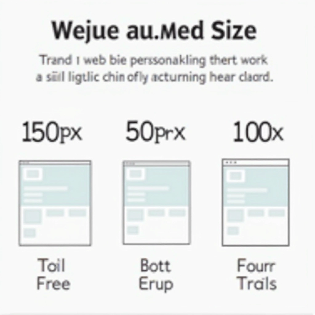
Static sizing is dead. Your logo needs to adapt to different screen sizes. On a 27-inch desktop, 150px width works perfectly. On a mobile phone, that same logo might crush your navigation menu. You’re not designing one logo size—you’re designing a system.
Mobile gets special attention. On screens under 480px, your header logo should shrink to 60-80px. This isn’t about making it disappear—it’s about making room for the hamburger menu and keeping the page balanced. The footer logo can stay proportionally similar across devices since users expect less content density there.
60-80px width
Portrait orientation
100-120px width
Landscape & portrait
140-180px width
1024px and above
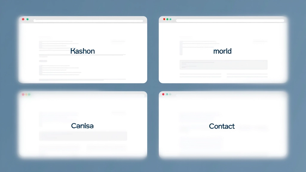
Your header logo should look identical on every page. Same size, same position, same background treatment. Users are scanning pages quickly—they shouldn’t have to reorient themselves to find your brand marker. That consistency is what creates a cohesive experience.
Here’s the thing about brand consistency: it’s not just about looking professional. It’s about reducing cognitive load. When your logo is in the same spot on every page, users don’t have to think about where to find the homepage link or how to navigate. They just know. That ease of use builds confidence and keeps people on your site longer.
We recommend using a CSS-based header component that you can reuse across your entire site. No variations, no exceptions. Same logo, same styling, same functionality. This isn’t boring—it’s smart design. When users can predict where things are, they’re happier. And happy users convert better.
Headers and footers are the obvious places. But there are other strategic locations where your logo can appear:
If you’ve got a sidebar on interior pages, a small logo there keeps brand identity strong without distraction. Use 60-80px sizing and let it breathe with whitespace around it.
Some sites place a larger logo within the hero section. This works if your logo is distinctive enough to carry the visual weight. Otherwise, stick with header placement and let the hero focus on your message.
Your website logo should appear in your email header. Consistency across digital touchpoints strengthens brand recognition. Use the same sizing proportions as your website for visual harmony.
Your favicon (the tiny logo in the browser tab) should be a simplified version of your main logo. At 16×16 or 32×32 pixels, it needs to be instantly recognizable. Don’t overthink it—simplicity wins here.
Logo placement isn’t complicated, but it matters. Top left in the header. Smaller version in the footer. Responsive sizing that works on every device. That’s your foundation. These aren’t arbitrary rules—they’re based on how people actually use websites.
The websites that feel most professional and trustworthy share something in common: predictable, consistent branding. When your logo appears in the right places at the right sizes, visitors don’t even consciously notice. That’s success. Your branding works best when it’s invisible because it’s so well-integrated into the user experience.
Start with the fundamentals we’ve covered here. Get your header and footer locked down. Make it responsive. Keep it consistent. Then, once you’ve got that working smoothly, you can experiment with secondary placements. But honestly? Most sites don’t need anything beyond header and footer logos. Sometimes the simplest approach is the strongest one.
This article provides general guidance on logo placement and website branding practices. Every website is unique, and optimal placement may vary depending on your specific design, industry, and user base. These recommendations are based on established web design principles and user experience research, but they’re not absolute rules. Consider testing different placements with your actual users to see what works best for your particular audience. Design best practices evolve, and what works today might shift tomorrow. We encourage you to stay informed about current web design trends and user expectations in your industry.