
Logo Placement Strategies for Websites
Where your logo goes matters. We cover header placement, footer positioning, and how to maintain visibility without overwhelming your design.
Read MoreMaster logo placement, brand guidelines, and cohesive design across your Malaysian web presence. Learn how consistent colour and typography create lasting brand experiences.
Discover in-depth guides on building and maintaining your brand identity online.
Where your logo goes matters. We cover header placement, footer positioning, and how to maintain visibility without overwhelming your design.
Read More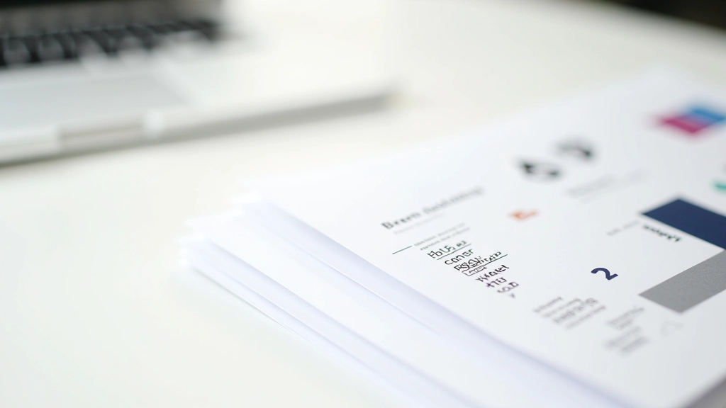
Brand guidelines don’t have to be complicated. Learn what to include, how detailed they should be, and why your whole team will actually use them.
Read More
Consistent colour and font usage builds trust. Discover how to apply your brand systematically without making your website feel rigid or boring.
Read More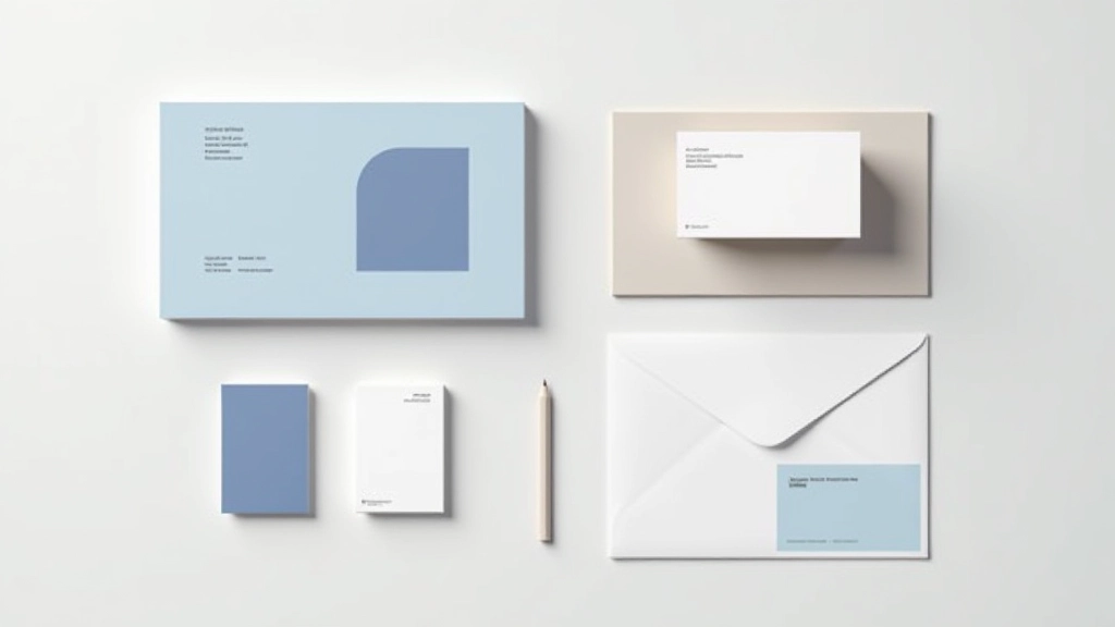
Your website is just one touchpoint. Learn how to extend your brand identity across all platforms and create a unified experience for Malaysian audiences.
Read MoreYour logo isn’t the only thing that matters. Typography, colour choices, and spacing work together to guide visitors through your site. When these elements are aligned, you’re creating a brand that feels intentional.
Typography isn’t decoration—it’s part of your identity. Pick primary and secondary fonts that work together and stay consistent. Limited choices actually help. Most successful brands use two fonts maximum.
Don’t just pick colours you like. Establish a primary colour, accent colours, and neutral tones. Document them with hex codes and usage rules. This becomes your visual language across every page.
Brand guidelines aren’t just for large companies. You need them too—even a simple one-page document helps. Include logo usage, colour specifications, typography rules, and spacing standards.
Use this checklist to audit and improve your brand presence online.
Your logo appears in the same position on every page, usually top-left or center. Size is proportional to page width.
You’re using 3-5 main colours across the site. Every colour serves a purpose—primary brand, accent, and neutrals.
Headings, body text, and links all use the same 2-3 fonts. Font sizes follow a logical scale.
Margins and padding follow a consistent scale. This makes the site feel organized and intentional.
You have a reference document showing logo usage, approved colours, fonts, and spacing rules.
Email, social media, and offline materials reflect the same visual identity. Visitors recognize your brand instantly.